Any intelligent fool can make things bigger [and] more complex.
It takes a touch of genius… to move in the opposite direction.
- Albert Einstein
A shared understanding of a project’s journey from inception to retrospective, along with common nomenclature, helps ensure that all participants understand priorities and tradeoffs, reducing friction and allowing teams to get more done with less effort.
UX Research shows that at least 95% of all UX portfolios include some version of the Double Diamond developed in 2004 by the British Design Council, and which was itself derived from an earlier model proposed by linguist Béla H. Bánáthy. Although the Four D’s alliterate well, some audiences get confused about what Develop and Deliver mean.
The Double Diamond is now well understood as a process of divergent and convergent thinking to enable fast and efficient iteration before committing scarce resources to costly and time consuming development - First make sure you’ve fully explored the problem. Second, make sure you’ve fully explored the solutions.
The UX Readiness model, originally developed by the TIBCO UX Team, has proven itself as a solid tool for managing conversations about design. The model aligns design process participants in terms of what decisions are important for a particular discussion, avoiding the organizational tension which can arise from conflicting goals.
In this model, an organization, team, or individual, develops an increasingly subtle understanding of what it means to Design, moving from the bottom to the top, starting with how stuff looks and progressing though how things work, why things exist, and ultimately, how to define a culture that wants to do all the other stuff.
A mature organization works top down, starting with Culture, which informs Product Experience, which influences Product design, and so on.
The power of the model comes from its use to understand and work with the context of a conversation between a design team and an audience. For example, if your audience want to talk about why a button is where it is on the screen, an answer about the product roadmap is unlikely to satisfy.
Mapping and sharing project journeys ensures participant alignment.
When participants feel heard and understood, teams become more engagement and collaborative.
A clear understanding of the development stack is often overlooked.
It's critical that executives and other key stakeholders understand the value of design. It's easy to assume that people "just know" what other people do all day long, and why it matters.
Publishing key work in progress ensures stakeholders are engaged and informed.
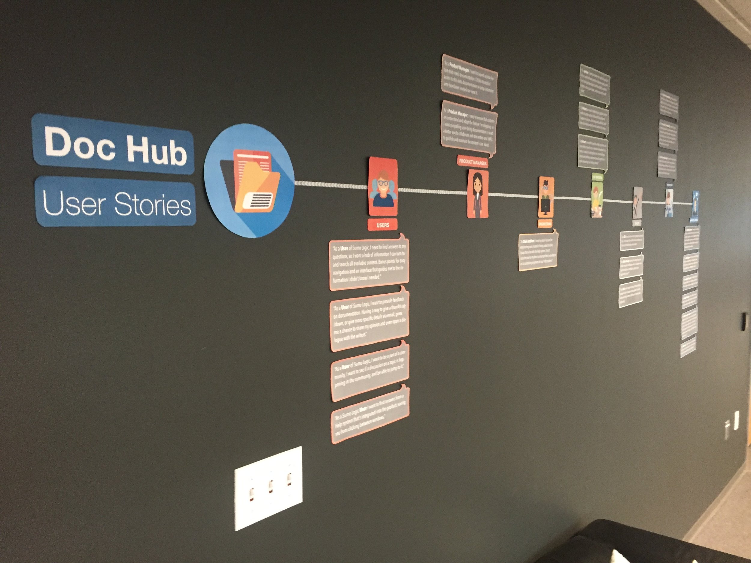
The "Heck yeah!" wall showcases key projects.
Project artifacts make the intangible feel real and valuable.
An early version of the Readiness Model.
Another version of the Readiness Model.


